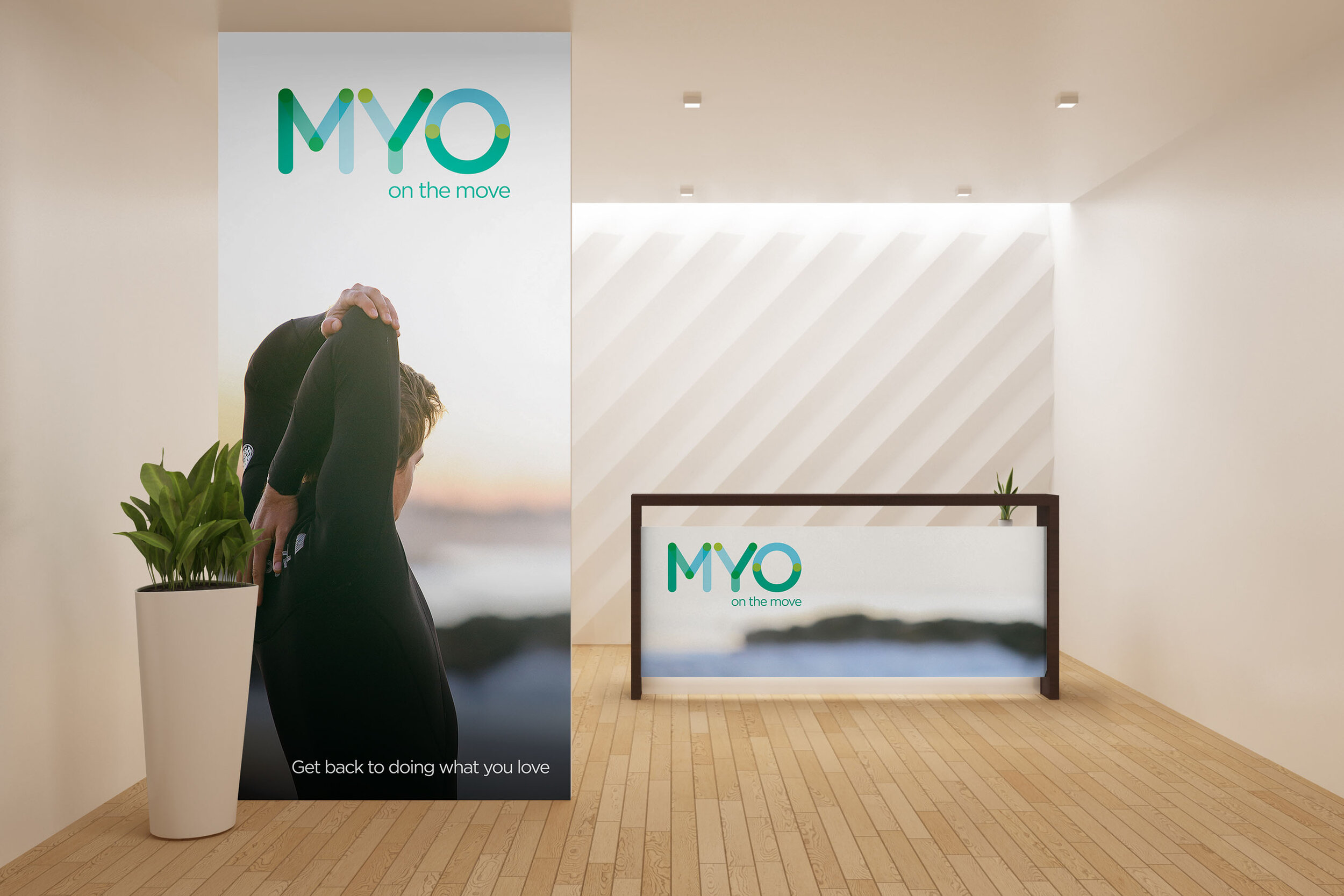
MYO on the move
Design Brief: A logo for a physical therapy start-up business.
Challenge: To demonstrate the importance of connecting logo design to the creation of a brand.
Solution: By creating multiple mock-ups of the logo using consistent font, colour palette and style of imagery, I was able to show the client how she could get the most out of the logo and make it look slick and professional.
Feedback: The client loved her new logo and started her business feeling confident and professional.


